
What’s on the outside does count - at least, when it comes to branding. One study found that ‘up to 90% of snap judgments made about products can be based on color alone’. The color of a brand has a strong influence on our feelings about it - and we’re very perceptive about whether a particular color choice really ‘fits’ the brand in question.
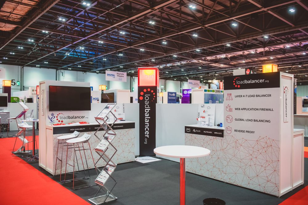
During this year’s IP EXPO , somebody passing by our stand remarked that our choice of color scheme is a little odd, given that our product is supposed to reassure people. ‘Doesn’t red usually stand for danger?’
There’s some truth in this. According to Bourncreative:
Red is a highly visible color that is able to focus attention quickly and get people to make quick decisions, which is one of the reasons fire trucks and fire engines are usually painted red. Flashing red lights mean danger or emergency, while stop signs and stop lights use the color red to alert drivers about the dangers of the intersection.
What you see = what you get
So maybe some people feel like our brand is shouting at them, or warning them to stay away. We’ve recently been dialing back the red in some of our design, for that reason - but we still think there’s plenty to like about it. Red can represent ‘action, confidence, and courage’. It can be ‘assertive, daring, determined, energetic, powerful, enthusiastic’. Those are associations we can get on board with.
Because with us, what you see is what you get. Honesty and directness are deep in our company DNA.
When customers come to our support team with their ideas, we’re happy to challenge them if it means getting the best outcome. We don’t pressure people to fork out for fancy features they don’t need: in fact we’re more likely to talk you down to a simpler solution. Our priority is finding the best fit for our customers.
A clear idea
Contrast the impact of red with the associations of, say, a pastel color. In color psychology, the right shade of yellow evokes ‘optimism, clarity and warmth’. The yellow in this image, from Kemp’s stand at IP EXPO, is telling you to relax: you’re in safe hands. The text is telling you that you get a better deal with Kemp than with their competitors.
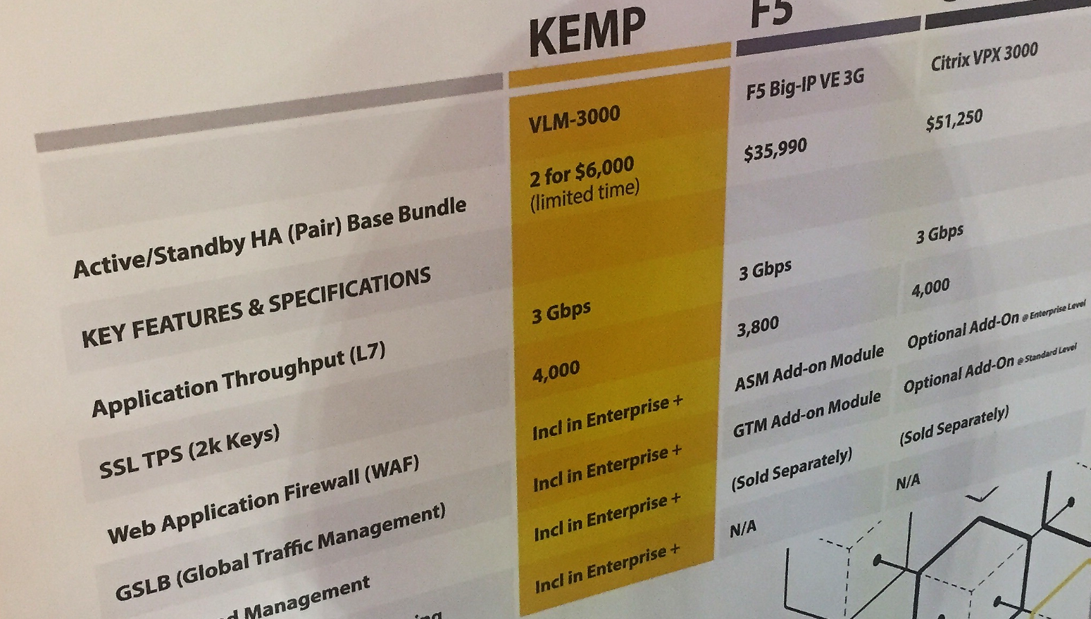
With F5 and Citrix, extra modules like WAF and GSLB are ‘add-ons’, whereas with Kemp they’re…. ‘Included in Enterprise +’. So, not included in that 2 for $6,000 deal, then? Part of their more expensive subscription package, as an optional add-on? We're sure Kemp aren't deliberately setting out to deceive anyone - but they have been a bit creative with the truth here.
Maybe the real danger sign isn’t red, but any color being used to falsely reassure you. There’s no point in a company signalling trustworthiness through their brand if it isn’t also there in their behavior.
It's a clear idea: transparency should be at the top of the list when you’re choosing where to buy your load balancer. Whatever color the wrapping is, you want a vendor who’s honest with you from the start.